
Hiree
Where Business Needs Meet Intuitive User Experience.
Hiree was strategically developed to streamline the recruiting process, empowering users by enabling efficient candidate sourcing and assessment on an optimized, user-friendly platform.
Project Overview
MY ROLE
UX/UI Product Design
CATEGORY
Recruitment Technology
DURATION
16 weeks
PROJECT TYPE
Solo project completed at Mento Design Academy
MENTOR
Figma • Miro • Lookback • Optimal Workshop
Jump to


Introduction
My inspiration for this UX Design Project came from previous experience as a recruitment consultant. Having dealt firsthand with the complexities of recruitment platforms, I chose this topic for my first project at Mento Design Academy. The research phase involved interviewing real recruiters, although the project remained a conceptual case study. I hope you find my UX journey as engaging as I found the process.
See Hiree Video IntroIdentifying the problem
Many companies face the challenge in promptly and effectively filling job vacancies with well-suited candidates. We know that recruitment platforms might be contributing to hiring inefficiencies. What if we could create a recruitment platform that is not only easy to use but also highly efficient in streamlining the hiring process and ensuring companies quickly and effectively fill job vacancies with the best-suited candidates?
Discovering Insights Through Research
I conducted secondary research to learn more about the industry, current trends, and our target audience. I checked out sources like Forbes, LinkedIn, FlairHR, and Talent Labs to get a solid overview. My research revealed significant gaps in how recruitment platforms support recruiters in their work. I found that recruiters spend approximately one-third of their week on candidate sourcing. This significant time investment is due to several challenges: complex platforms, inefficient filtering systems, large applicant pools often filled with unqualified candidates, and the growing prevalence of AI-generated resumes.
Uncovering Market Insights
I performed a competitive analysis to gain insights into existing market offerings, understand user perceptions of these platforms, and identify opportunities where our product could excel and meet unmet user needs. Through this analysis, I discovered that while many platforms offer a variety of capabilities to support talent acquisition professionals in their recruitment efforts, users frequently encounter challenges such as complex interfaces, inadequate or inefficient search filters, irrelevant candidate recommendations, and inefficient communication channels between recruiters and candidates. This analysis kept highlighting the critical need for user-friendly interfaces and platforms that effectively support recruiters in finding qualified candidates.
Gathering User Insights
Now it was time to conduct user interviews. I engaged with 5 actual recruitment professionals. Obtaining real-life data was crucial to gather genuine insights into their needs, pain points, and experiences using different recruitment platforms.
Participant Quotes: Insights into User Experiences
INSIGHT #1
"I would just love a more intuitive system that's able to search existing candidates."
INSIGHT #2
“It affects my time management and how quickly the role progresses because if filtering was a bit better then I'd be able to proceed to interviews faster and I get the candidates to manager faster."
INSIGHT #3
"I think the platform is a little bit old fashioned and could be better.”
I discovered users perceive many recruitment platforms as non-intuitive and lacking user-friendliness. They expressed frustration with inadequate filtering systems, which results in a time-consuming manual review process. 💡 It became more evident that recruiters are in need of platforms that prioritize user-friendliness without sacrificing effectiveness.
From Research to Insights
After conducting user interviews, I used Affinity Mapping to group the data into distinct categories, which helped identify key themes and trends.
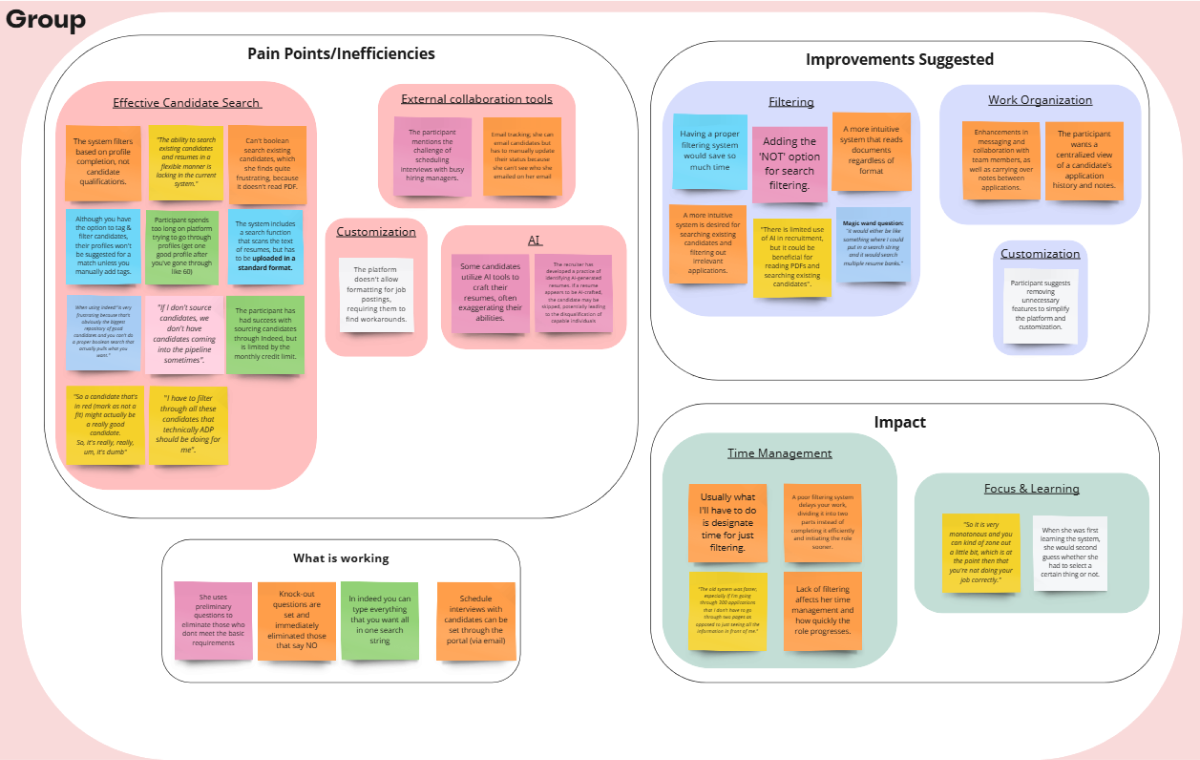
Identifying the problem
One of the main themes was about user pain points, particularly around Candidate Search Effectiveness. I also found that users frequently suggested improvements, with the most common being enhancements to the filtering functionality, indicating this was a significant area of concern. The ineffective search and filtering tools weren't just a small issue; it greatly impacted users’ work efficiency and overall experience.
Then, to better understand my users, I used Empathy Mapping to explore their emotions more deeply.
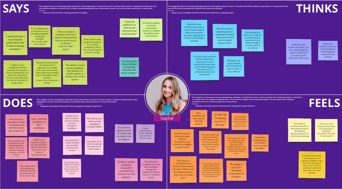
While reviewing my interview scripts, I noticed the word "frustrating" appeared frequently. Users described their jobs as "tedious" and "monotonous" and expressed feelings like "I feel like I am wasting my time." These insights highlighted the emotional toll of inadequate systems on users. By mapping these emotions, I could better understand the impact of these frustrations on users' morale. It became clear that the lack of an effective system was not just a functional issue but also a significant emotional and psychological burden. Key Insight: When employees find their work monotonous and frustrating, it can lead to decreased job satisfaction, lower productivity, and higher turnover. These feelings can diminish motivation and engagement, resulting in a lack of innovation and reduced overall performance.
Key Insight
Key Insight: When employees find their work monotonous and frustrating, it can lead to decreased job satisfaction, lower productivity, and higher turnover. These feelings can diminish motivation and engagement, resulting in a lack of innovation and reduced overall performance.
Persona Spotlight: Meet Natalie
Many companies face the challenge in promptly and effectively filling job vacancies with well-suited candidates. We know that recruitment platforms might be contributing to hiring inefficiencies. What if we could create a recruitment platform that is not only easy to use but also highly efficient in streamlining the hiring process and ensuring companies quickly and effectively fill job vacancies with the best-suited candidates?

💡Drawing from my research and analysis insights, I could objectively prioritize areas for improvement. It became clear that users encountered challenges due to complex platforms, and insufficient tools for filtering and searching candidates, impacting both operational efficiency and emotional well-being.
Main Goals:
- Enhance candidate search efficiency
- Improve filtering system functionality
- Implement a more user-friendly platform
From Insights to Solutions
Unleashing Creativity & Humbling Lessons in Ideation
My main takeaway about the UX process emerged in this section.
I spent considerable time crafting elements and features to define the overall solution's functionality and feel. Even though I always had the main pain points in mind, looking back, I now see the importance of starting with a focused approach on addressing the main pain points and building from there.
Before Concept Testing
In my initial design idea, I aimed to present users with a quick, visual overview of candidates. The design included:
- Resume Snippets: Displaying brief snippets of resumes to provide a visual summary of: suggested candidates from the database, top applicants (both system-sorted and ranked).
- List of Applicants: A list of applicant names that, when clicked, would pop out a detailed resume view.
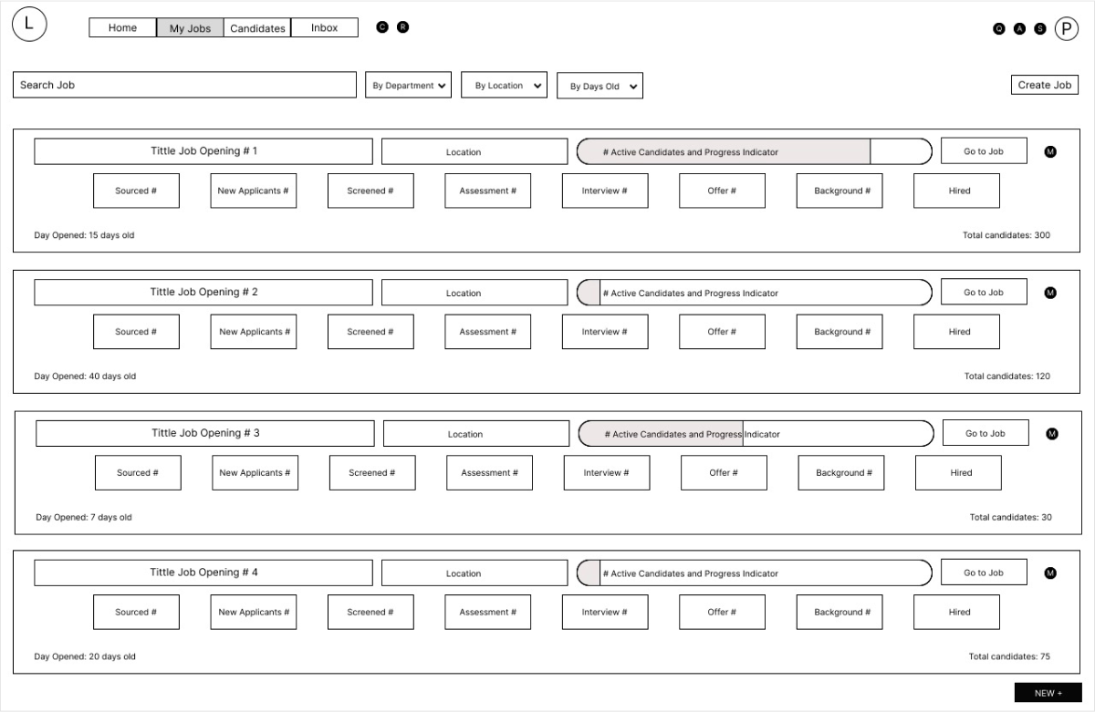
After Concept Testing
After testing the initial concept, it became clear that the design was too busy and did not effectively achieve the intended functionality. With guidance from my mentor, I realized the importance of the "less is more" principle in design, which was crucial in training my eye for effective design.
To address the feedback, I made significant changes:
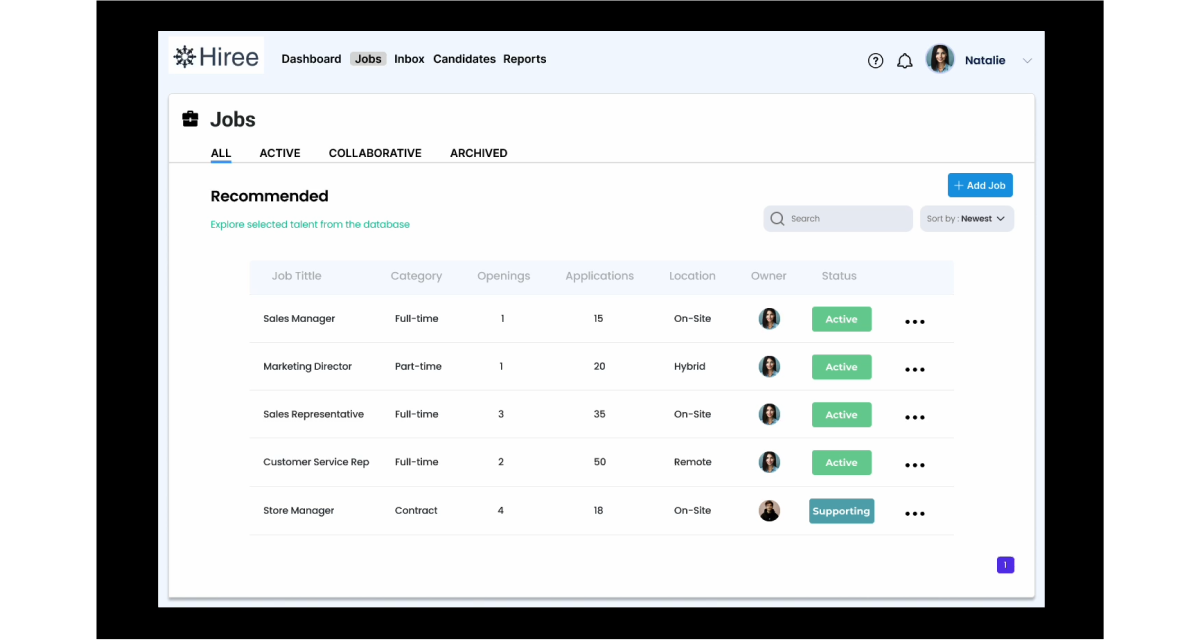
- Simplified Navigation: I introduced a side navigation menu that displayed the main categories, making it easier for users to navigate the page.
- Streamlined Presentation: Candidates were presented in a straightforward table format, providing users with a clear and concise overview of applicants.
With renewed focus, I set out to iterate my initial wireframes. This process taught me a valuable lesson: complexity does not necessarily equate to functionality. It highlighted the importance of simplicity and user-centered design, guiding me to create a more intuitive and efficient interface.

Prototyping and User Testing: Unlocking Key Insights
Based on user feedback, I implemented design changes to enhance intuitiveness and embrace the "less is more" principle.
The final design reflects the following iterative improvements:
- Implemented a side navigation menu on all pages for consistency.
- Removed non-essential buttons to streamline user interaction and reduce cognitive load.
- Restructured the side navigation menu options for clarity.
- Applied color-coded elements more subtly to enhance the user experience without overwhelming the interface.
After completing my iterations, I conducted another round of user testing to validate the design changes. The tasks remained the same, and the final results, along with user feedback, are as follows 👇
Final Design
If you'd like to see Hiree in action, please watch the video below. Alternatively, if you're interested only in viewing Hiree's final designs, feel free to keep scrolling.
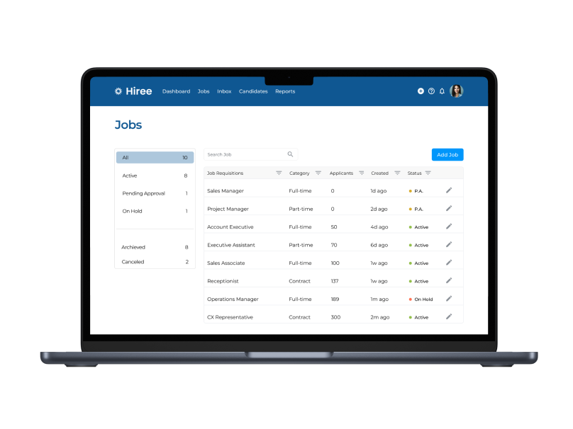
Simplicity with Impact
Navigation has been optimized for intuitive use without unnecessary complexity.
🗣 Users Feedback
“A cleaner and more intuitive system is preferred to reduce stress because we have enough stress as a recruiter anyway, like, you know, you got clients yelling at you and people not calling you back and stuff. So if you can remove the stress here, I think it's great.”
- The clear presentation of job requisitions was highly appreciated.
Effortless Talent Discovery
Intuitive sorting, which makes it easier to find the right candidates.

🗣 Users Feedback
“It's clean, it's pretty straightforward. The headings are very clear. I have options to view the resume there. It's pretty intuitive.”
- Users appreciated the platform's clean and straightforward interface, as well as the intuitive sorting between new and active candidates.
- The ability to see the source of candidates was highly valued.
- The color-coded presentation of information was well-received for being clear and not overly loud or busy.
Streamlining Candidate Search
User-friendly filters and a streamlined search function.

🗣 Users Feedback
“It’s intuitive and awesome. I don’t have to think twice about it. You know, I could probably, um, just click around and figure this out pretty quick, which I think is great.”
- Users find the candidate search process straightforward, with easy-to-use filters and a simple search function.
Choosing the Right Elements
I aimed for a minimalistic design to embody the principle of "less is more."
Color Palette
Navy Blue
Primary color
#585CE5
I chose navy blue as the primary color for our platform. This isn't just because it's timeless and stylish in fashion and design, but because of what it represents. Navy blue stands for stability, trust, and reliability. By incorporating this color, I wanted to ensure that users feel a sense of confidence and dependability as they navigate the platform.
White
Primary color
#A1A3F6
To create a clean and uncluttered feel for the platform, I primarily used white as the background color.
Font
I opted for the Montserrat font because its clean and modern design, Montserrat ensures that our content is effortlessly legible—an essential factor for engaging users and ensuring accessibility.
Project Results
Hiree effectively addressed our users' key pain points. The platform showcased strong potential with its user-friendly design, effective sorting features, and overall ease of use. Participants expressed high satisfaction, preferring Hiree over more complex systems. “Like I've used Oracle, I've used some other uh like Taleo and this system is a dream in comparison to how complex some of those other platforms are. So um yeah, I mean, if it were up to me, I'd choose this one.”
“Like I've used Oracle, I've used some other uh like Taleo and this system is a dream in comparison to how complex some of those other platforms are. So um yeah, I mean, if it were up to me, I'd choose this one.”
Reflection
Through this experience, I've gained invaluable insights and found that certain aspects came more naturally to me than others. Drawing from my background in business and recruitment proved immensely beneficial. My prior roles in recruitment provided me with a deep understanding of the industry. It was eye-opening to witness how quickly bias can emerge, reinforcing the importance of maintaining impartiality and objectivity in every project.
Having spent considerable time interviewing, screening candidates, and collaborating with business partners, conducting interviews felt like second nature. However, what was new and I particularly enjoyed was analysing the information and transforming it into user insights—a process that was fascinating and rewarding.
Now armed with a deeper understanding of the design process, I’m motivated to conduct more extensive competitor and user research in future projects. Additionally, I want to gain more practice with tools like card sorting and experiment with A/B testing.
When it comes to UI design, it was a completely new challenge for me, demanding considerable effort—but it was just as rewarding as it was challenging. Lessons were learned, and I am dedicated to starting my ideation process with the main pain points and expanding outward. This approach will ensure a more streamlined design process.
I look forward to applying these insights and pushing the boundaries of design in my upcoming UX projects.