
Readify
Imagining Digital Readingwith Creative UI Concepts.
Conceived as part of a UI Challenge project, Readify emerged as an innovative e-library app offering a personalized and user-friendly interface for navigating and organizing digital books, magazines, and articles. The platform integrates interactive community features like book clubs and reading challenges, fostering user engagement and enriching the overall reading journey.
Project Overview
MY ROLE
UI Designer
CATEGORY
Digital Publishing
Tools
Figma
PROJECT TYPE
UI Challenge at Mento Design Academy
DURATION
We were given a week to complete, but it took me 5 days to deliver as I juggled it alongside my full-time coursework.


Introduction
These UI Challenges are all about unleashing creativity and refining design skills. Their focus is on creating eye-catching visuals, with the ultimate goal of providing a fun and competitive way to practice and improve.
UI Challenge Brief
Design 2-3 screens for an “E-Library and Digital Reading App”, aiming to provide an immersive reading experience, allowing users to explore, read, and manage a wide range of digital books, magazines, and articles.📚
🔍 Hints
-
Incorporate design elements that enhance readability and navigation within the app. The interface should reflect an inviting reading atmosphere, prioritizing comfort, customization, and accessibility.
-
Consider intuitive gestures or touch controls for easy navigation through library collections, adjusting font sizes, themes (like dark mode), and bookmarking.
-
Include features for tracking reading progress, setting reading goals, and recommendations based on reading history.
-
Think about integrating community features like book clubs or reading challenges to engage users.
I was excited about this project because I regularly use e-library apps and ebooks such as Kindle and Play Books. This personal experience motivated me to prioritize creating an enjoyable and user-friendly digital library experience.
Constrains
With the UI Challenge's time and resource constraints, I relied on my user experience to craft a visually appealing interface within the project's timeframe.
Research
In conducting my research, I reached out to a few friends to gather insights about their experiences with e-reading platforms.
To my surprise, out of the 5 friends I asked, 4 were unaware of whether their local library offered an e-library service. Many of them prefer using Audible for audiobooks, as they find listening more convenient than reading. Also, because they don't read extensively, the membership offered meets their needs well.
I also put on my UX glasses and evaluated my own e-library app, as well as my ebook.
Design
Feedback-Driven Iterations
After submitting the designs, I received feedback. Based on it, I proceeded with the necessary changes.
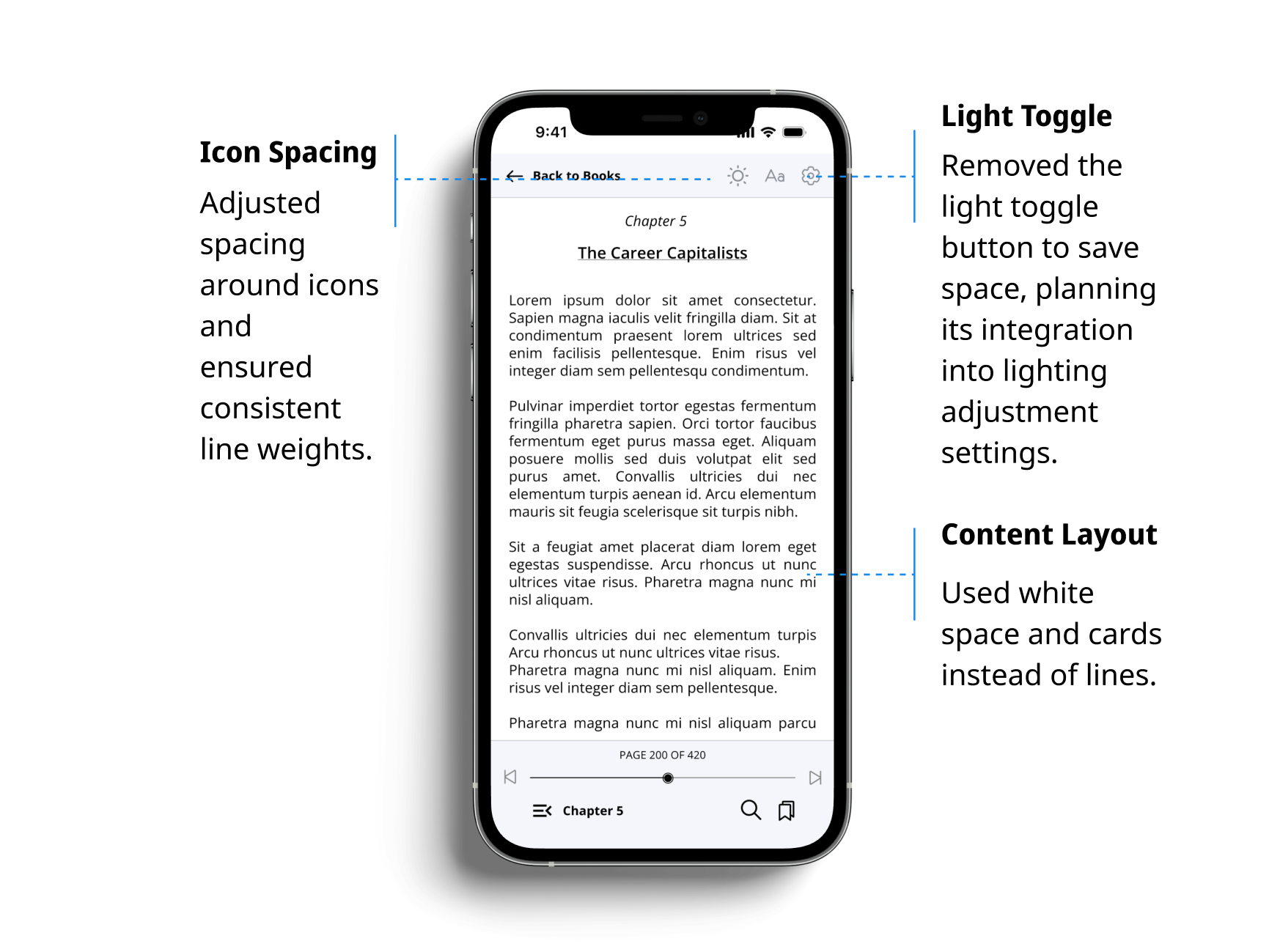
Design Iterations- Before

Design Iterations- After

Design Iterations- Before

Design Iterations- After
Choosing the Right Elements
Color Palette
Indigo is often associated with depth, intuition, and knowledge. It can evoke a sense of wisdom and insight, aligning well with the pursuit of learning and reading. So I chose Indigo as the primary pop color for our reading app because it brings a sense of wisdom and calmness, enhancing the focused reading experience against the white background.
To maintain visual harmony, I also used a lighter shade of Indigo for buttons, ensuring readability and creating an inviting interface that is both sophisticated and easy on the eyes for all users.
Font
I chose Open Sans for our reading app because it's easy to read and looks modern. Its clean and open letterforms ensure text remains clear and legible, enhancing the reading experience across different screen sizes.
Results and Reflection
Participating in this UI Challenge was a rewarding experience where I gained valuable insights into UI design. The feedback I received was very helpful. Moving forward, I plan to integrate user testing in future UI Challenges to ensure clarity and accessibility of the elements for all users.